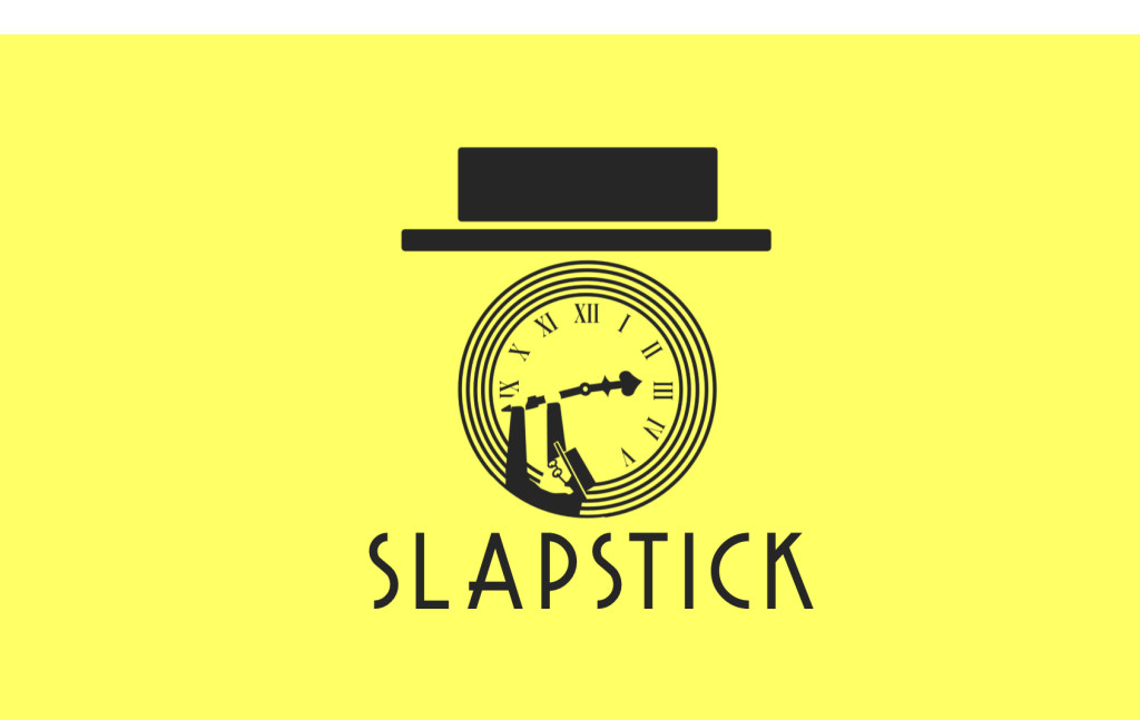
SLAPSTICK
Film Festival Branding Brief
2020
This brief was an exercise in branding a film festival, focusing on communication and spreading content over many platforms. I chose to base my film festival around 1930/40s silver screen. In doing so I could explore the lavish Art Deco imagery of the era, as well as celebrate the biggest names in early film – such as Laurel & Hardy. The comedy direction was an obvious choice for me, as someone who has a love for all forms of comedy.
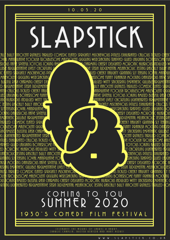
POSTER
The poster features a cartoony representation of the comedy duo Laurel & Hardy. The yellow words in the background are words that can be used to describe comedy films of the time. Included in the poster is the title, event start date, short description and website.
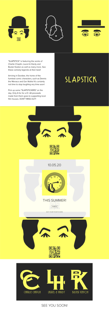
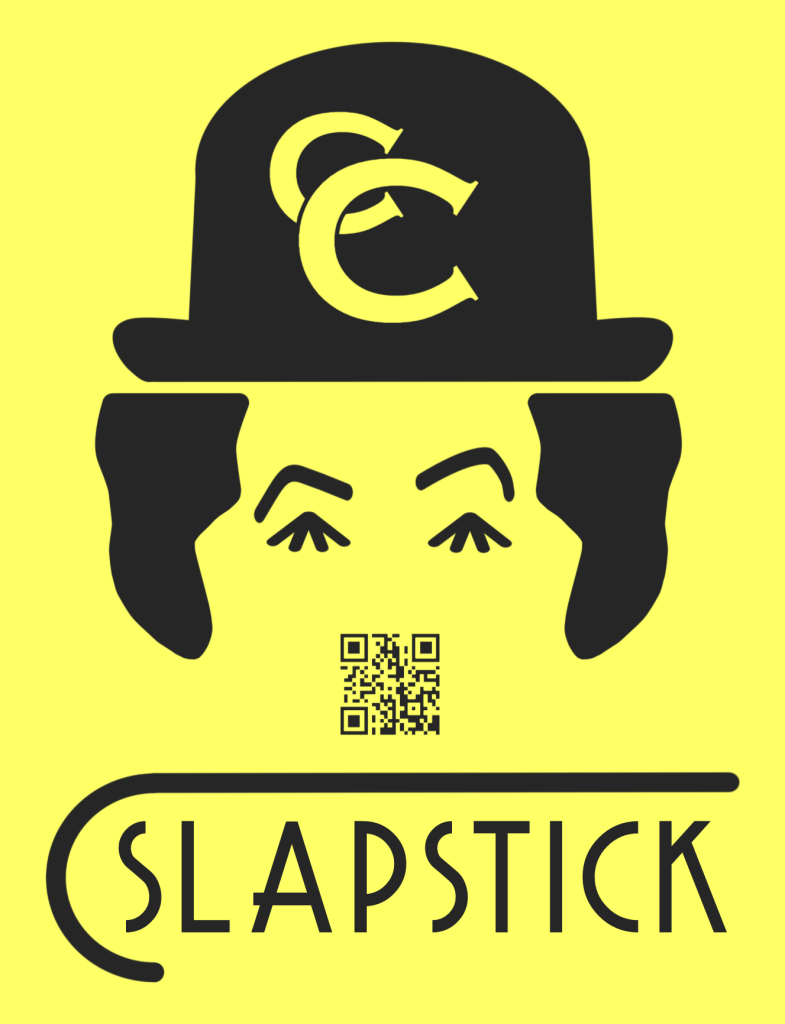
Flyer
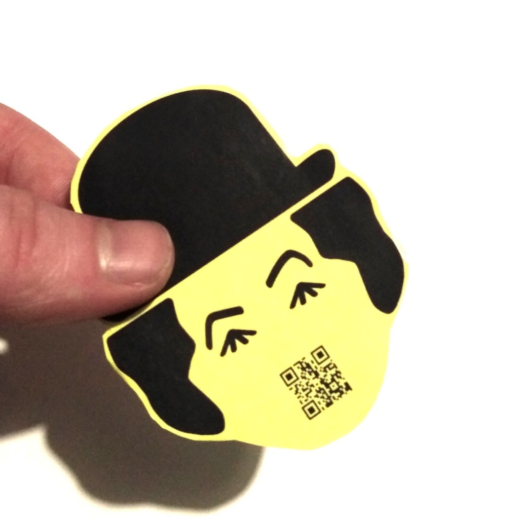
The flyer features a stylistic image of Charlie Chaplin. Like the majority of imagery in “SLAPSTICK,” I utilised negative space in forming the image. The hair of Chaplin is actually a silhouette of his shoes. Chaplin’s moustache is designed to be a QR code that when scanned would direct people to the film festival website.
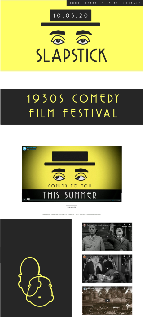
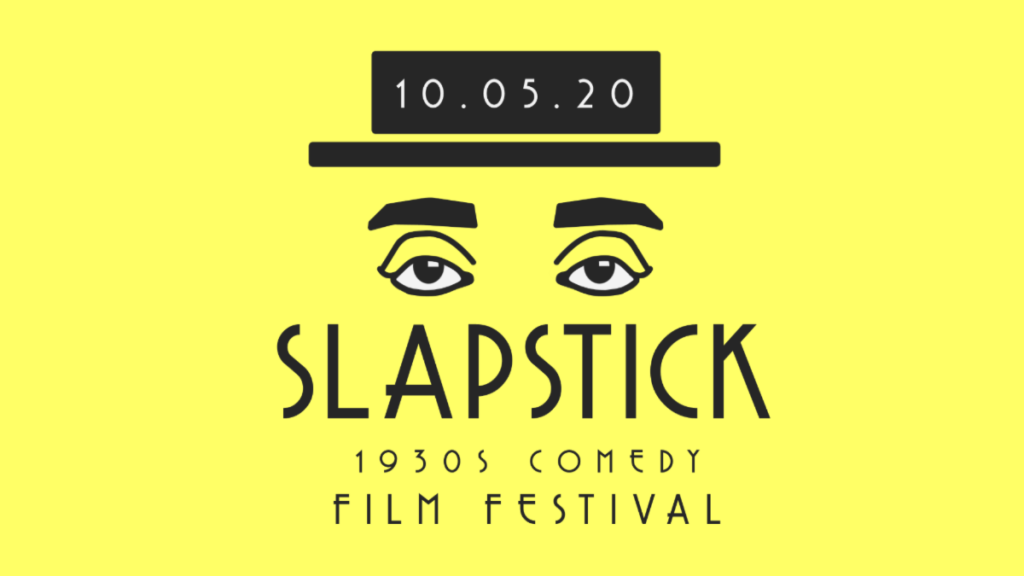
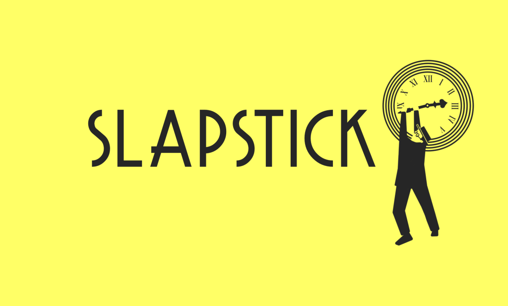
Various Banners for online use
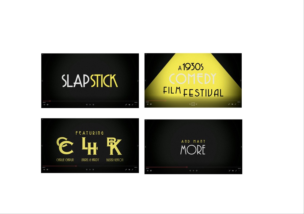
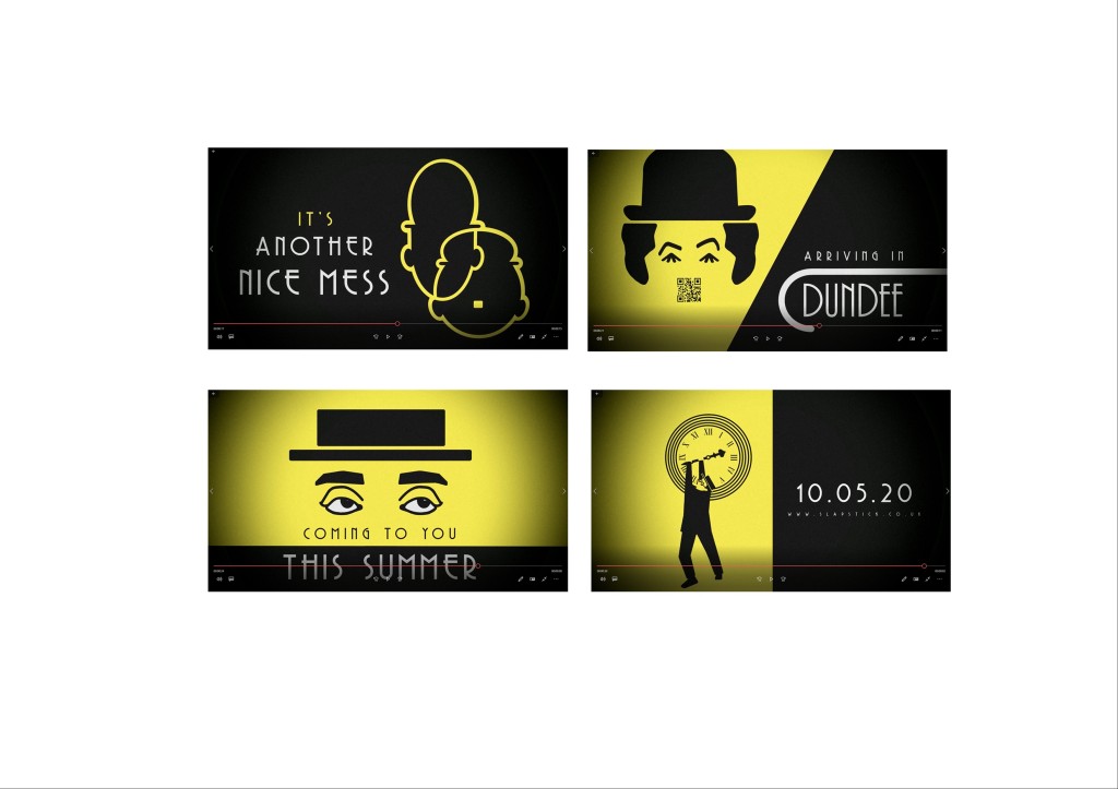
Promotional Video
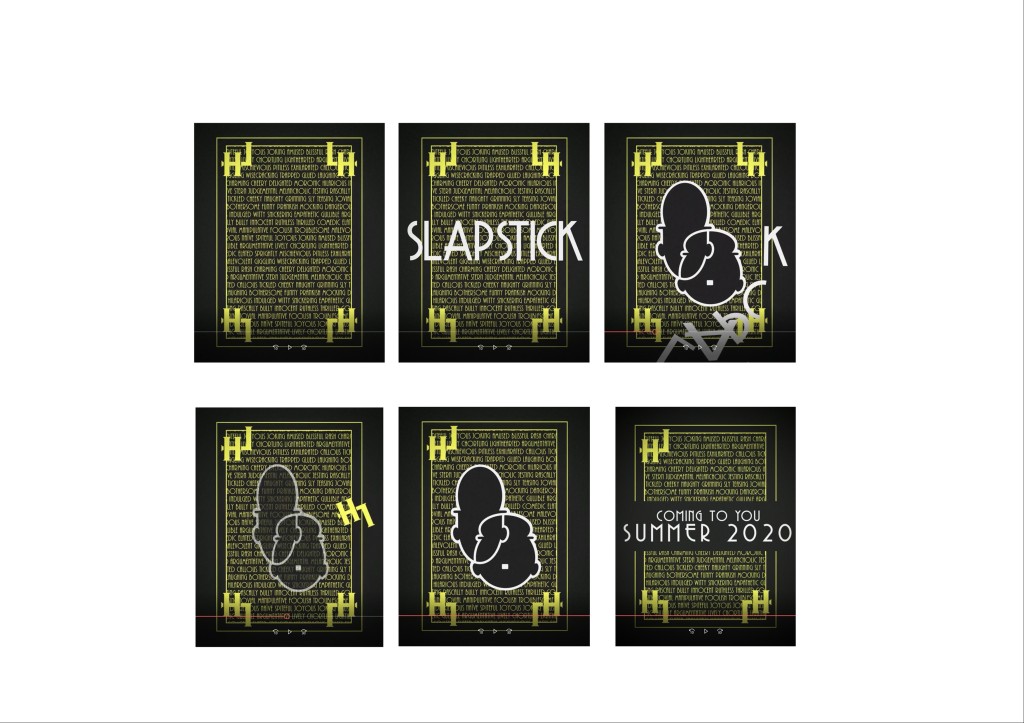
MOTION POSTER
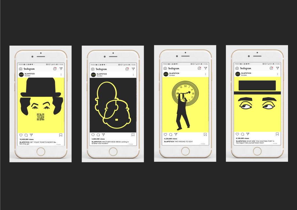
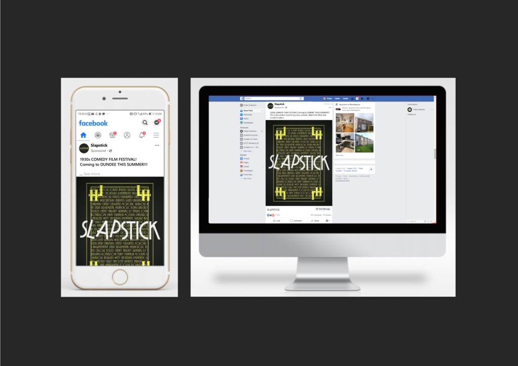
SOCIAL MEDIA POSTS
As part of the campaign, a series of promoted posts would be used to build the hype for the event. Instagram and Facebook are the examples used for this event.


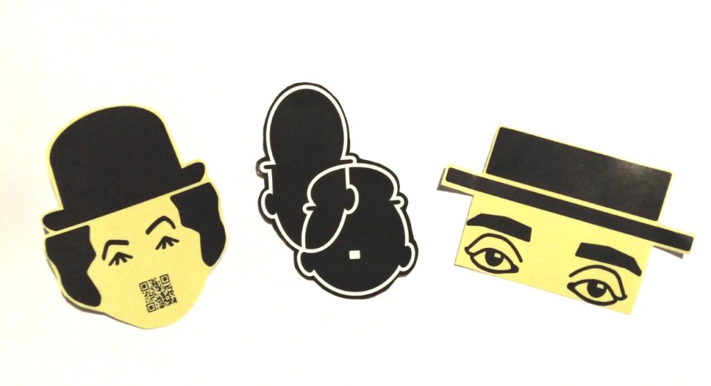
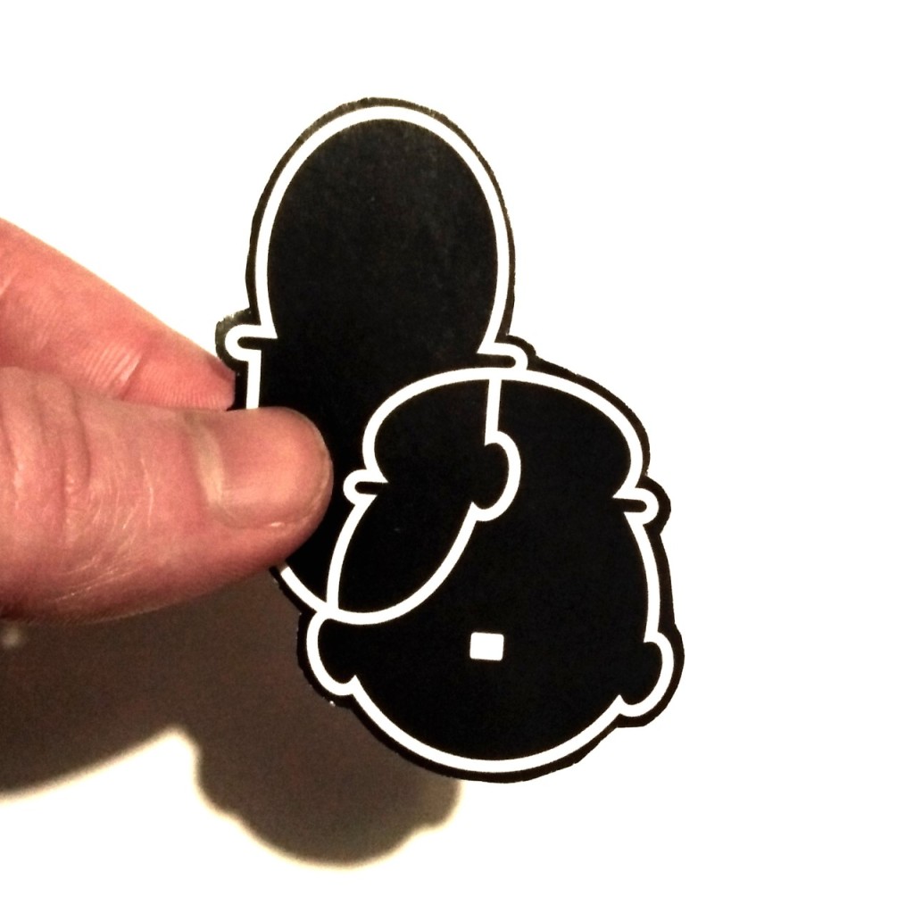
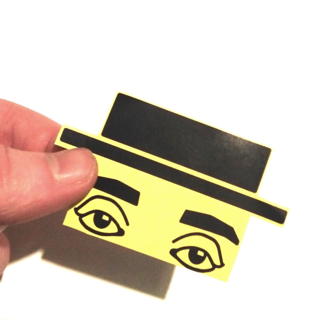
STICKERS
Sticker sheets were designed to be sold on site to give attendees a keepsake. This would hopefully keep the festival as a lingering memory in the back of their minds, perhaps making them more willing to return for future events.
Website